Thursday, 31 March 2011

Design Context : Group Tutorial Feedback

Just before we get going I would like to say that this is the second time I have written this.  Blogger decided not to post and delete what I had written, thanks.
(I will try to recite what I wrote before).

The best way to tackle this feedback will be to go through the notes I took while listening to others and then discuss the further issues in more depth.  Also I would like to apologise to the group for having to endure my waffle.  My thoughts are usually a bit wordy and boring, which I why I tend not to share them, however I assure you that in the end they do make some coherent sense.  Apparently my speaking skills just weren’t switched on today.  OK!


Notes

·      The context book is a distilled / focused version of our context blogs.

·      I should test my questionnaire before sending it off to studios.

·      My personality should come through in the questions, this will inform the tone and the responses.

·      Interview would benefit from being focused on a particular subject.  For example, typography in communication, and the clarity of successfully using a grid.

·      Studio work will be selected on the basis of what I interpret the piece of work that optimises their practice and ideology.  This could be typographic, engaging with culture or just a very successful piece of communication.

·      Consider the sections of the book and how the shift of focus should be immediate. This could be kicked off with key quotes that set a tone of clarity, objectivity or creativity.

·      Interviews and questions can be broken up to help aid the structure of the book and the chapters.  The structure should lead somewhere and ultimately leave the reader questioning what the already know.

·      A case study of how typography has been used on a large scale project to effectively communicate and engage with culture.

Ok so those were the notes, now for a little more detail and suggested direction. 

I was cut down a bit for planning too far ahead and having too much of an idea of what I wanted the final article to be, which yes I did, but in my mind a final outcome isn’t something to work towards, but just a physical impression of what my thoughts are.  It gives substance to though, from which further evaluations can be made.  Without drawing out my initial sketches I would no have know for example that the 3 sections I had broken the book into may not be as effective as say using sub-sections within those main 3.  Anyway… form follows function bla bla. I know what the content is; it is answers, interviews and quotes.  The tone and content will inform the design direction. Annnnnnyway.

A good piece of feedback, which I am greatly in favour for, is that of the pub discussion.  I should gather us a few mates with a pint and raise some of the issues I would be asking the studios and designers.  This way a discussion may boil my questions down to just a few core ideas that need exploring. 
Also I need to make it clear at this stage what it is about the sections that will create a clear thread throughout the book.  The content will drive this.

Something interesting that will certainly drive the tone of the book is asking designers about their worst clients who have basically made them push aside their awesome deign in favour of what the client think is best for them.  Basically I need to provoke some emotional response from the designers in order for this to be successful.  After all when was the last time you spoke to a designer who didn’t want to bitch about their worst client?

CLIENT Vs DESIGNER

A question may be something like; ‘what is your worst case of a client ruining a brilliant concept and execution of a project?’

This can also lead to interesting questions such as; ‘what have you done in these situations to persuade or advise the client.’

TENSION & CONFLICT

Creating a dialogue and understanding between the designer and the client will be very fruitful, while the tone will be fun to read as the personalities of pissed off designers will come through heavily.

Another idea is to talk to the wider creative sectors, basically my friend group, which consists of a film-maker, photographers, an illustrator and a copywriter (among other graphic designers obviously).  This shows that we are all connected by one thing, annoying clients.  Again, what designer wouldn’t want to hear about that?  All this will lead to further debate and clarification of questions.

Finally the idea of talking to the clients isa fun one.  The opposed perspective could being to light whether they are happy with what they received, what their input on the design was, or whether they feel the designer indulged themselves in an ego trip and produced an utterly non-objective piece of work.

COMMERSE Vs DESIGN 

(I must try to remain impartial, however unlikely it sounds).


Design Context : Context Planning

Generally I find it hard to keep on top of paper work. I am not an unorganised chap by any means, but I prefer to not lug a wadge of paper around with me whenever I want to do some work.

So here is an initial plan for my context book, it covers the structure and potential content (should I achieve it) of both chapters as well as covering the questions I will be asking and the studios / designers I will be contacting.

This is a rather confusing starting point perhaps, but it will be enough to sift through for the real good quality material.


Flatland (ISTD) : Boards

Wednesday, 30 March 2011

The Lover

Besigned by Harold Pinter this 'The Lover' range for a theatre production is slightly strange for some reason.  The sharp type and red suggest promoscous behaviour as well as love and passion.  The very clean modernist layout is married well with the rather deep yet cold photographs.

I think it is well designed, providing the show is about a love that is not all that it seems.  As it is a theatre production that is almost certainly the case.  The big red bards are confusing, maybe they conceptually represent the couple, wile the thin line between suggests a gap, a small sliver where all is not as it seems. Who knows... I would have to talk to Pinter to find out this much I suppose.

Yeah, I like it.


Atipo and my Context book

So I saw this book and thought it was stunning.  I have a book that has a similar style to it called Foyle's Phalivery.  It is a collection of uncommon words in the english language, but that is another subject.  Working with black, red and white it makes for a powerful but graceful aesthetic.

I have drawn most inspiration from Vignellis Canon, cosidering the grid structure of it and the format.  This is an homage you understand, not a replica...  I had been thinking about using a more traditional typeface, rather than being typically 'Modern' going for either Helvetica, Akkurat or something like Grotesque.  I had thought about Baskerville or even Garamond, but know I think it would be nice to find myself the perfect serif.  Not an easy thing to do in just a few weeks but hay ho.  I want something gentle but crisp, medium contrast but not to flashy.


This book combines beautiful layout, a managable format and graceful binding.  I especially like the red thread.  I had something similar in mind, against the will of Fred who really doesn't want us to be thinking about the final article at thispoint, but of course thats impossible, we are designs...  I have draw up plans for it which I will scan and blog soon, tomorow I rekon.

Atipo


I couldn't quite place my finger on this group.  They are obviously prestigious and highly regarded, with collaborations with designers such as Muller Brockmann in the past.

Beyond this I picked out this series of poster designs for classic cinema films.  Some of them are truly beautiful and are produced though collaboration with art directors, designers and specialist printers.  The Maltese Falcon poster is technically brilliant in terms of print and typography.


Another example of typography merging with hand print is the Raging Bull poster.  The words themselves are full of character and provoke strong impact alone.  I just love the heirarchy and colour, there are so many levels of detail on a large scale image of this.  I would be happy to get a copy.


The poster on the left was designed by Muller Brockmann unsurprisingly. I am not sure how I feel about it, I am sure I have seen this exact design on another piece of his work, and that is essentially the problem with those pesky modernists.  Just as you start to love it and understand it you have the parallel realisation that its all the bloody same.  I do however like the opposing perspective of image and type, moving in different directions.  This created tension and hold the eye for some reason.


Function, Restrain and Subversion in Typography


The beauty of contemporary graphic design is that dozens of movements emerge and re-emerge from view. Yet, too often we are left with only the vague impression that something is going on. To appreciate what that might be requires us to slow down, ignore superficial trends, and take a more in-depth look. This is the approach taken by Function, Restraint, and Subversion in Typography, a survey of minimalist and brutalist typography in contemporary graphic design. This international collection documents the work of more than twenty-four graphic designers who engage in an aggressively simple typography. Lavishly illustrated with commentary by author J. Namdev Hardisty, the book explores the innovative posters, books, signage, and other forms of print design by such well-known designers as Daniel Eatock, Experimental Jetset, Spin, the Walker Art Center’s design studio, as well as those just beginning to make a mark on the design world, including MGMT., Project Projects, SEA, Xavier Encinas, Manuel Raeder, YES, and more.
About the Author
Namdev Hardisty is the founder, with Kimberlee Whaley, of The MVA, through which he has worked on print, web, and signage projects for a variety of clients, including Intermedia Arts, Minneapolis College of Art & Design, The Weisman Art Museum, and Analog Clothing. Namdev’s work is featured in Over & Over: A Catalog of Hand-drawn Patterns and Hand Job: A Catalogue of Type, both published by Princeton Architectural Press. He is also the author and designer of New Skateboard Graphics (2009). He received his BFA in Graphic Design from Minneapolis College of Art and Design in 2003.

Author: J. Namdev Hardisty
Year: 2011
Language: English
Format: 20,3 x 25,4 cm
Features: 256 pages, 390 color illustrations, 20 b/w illustrations
ISBN 9781568989662


Brogen Averill

Brogen Averill is a lot more commercial that the work I usually look at.  However recently I have been thinking about my role in this design world.  The old quote, 'be the change you want to see.' or something like that is a confusing one.  While what I want to see is better design accross the board, for independent businesses as well as large commercial companies I also want to see green fields and more nature.  

I have come to the conclusion that this is the two main desciding and contrasting factors of me.  On one side I like things like this Department Store identity and range, while I also need to address issues such as preservation, conservation and awareness to subjects that provoke and emotional response.  I think I can be both.


This first layout seems to pay homage to the great Karl Gerster and his typo-photo style that dominated catalogues for decades, a lagacy that has barely changed in the more fashionable companies such as this.


I have to quams with type looking sexy for the sake of sexy, as long as the job is done correctly.  This certainly is.  The slightly feminie typeface which is Century Expanded by the looks of it reflects the high-end fashion concept that the department store emmits.


The crisp and clean cut identity makes me very jelaous.  It is so bloody simple, its just a black box with some black type in it.  It looks like Grotesque, but could be any number of typefaces form these shots.  It really impresses me how these ideas are so simple yet effective.  The concept is addressed through a clean cut delivery and a simple excecuton. The Department Store exists as a fairly cold but very modern frame which by the looks of it can be placed anywhere and still look culturally relevant and awesome!


Book Fair : The Books

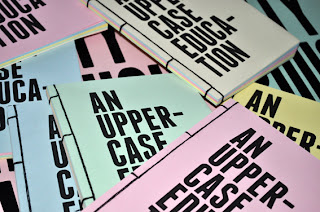
I forgot to take photographs of the content of the book somehow. I will get them up here shortly. But look at al the colours, oo0Oo0o.


Studio MW #2

There were only a few things of sudio MW that stood out, and after researching into Postmodernism for my dissertation I saw a lot of design that I liked for its play and process.  The work of April Grieman for example.  These T-shirt designs are fairly straight forward, but the process of making them has had influence from the Postmoder era. Not only this but it reflects the culture of Paris more so that other French studios.  Usually it is all big serif type (very sexy) but in this case they have used colour and form to attach itself conceptually to the diverse and colourufl landscape that is paris.


Studio MW


Studio MW are a 24 year established design comapny.  A lot of their work is very dependent on interaction with society and working on the street level.  However this small publication struck me as being rather appropriate.  Unfortunately they do not really say wat anything is about on their website, which is a bit annoying as I have no idea what it is about.  The direct translation of 'La demande en mariage & l'ours' is 'The demande in marrage & the bear.'  So I am a little confused as you see.


I think the simple use of colour, form and the exta interesting format feature helps make this little publication successful in whatever it was meant to be doing...i'm not sure that there is much ground to base that assumption, but I think it is a useful find non-the-less.

Tuesday, 29 March 2011

Flatland : Board Planning

Board 1

CONCEPT
Flatland covers a multitude of ideologies. It explores Victorian culture, social hierarchy but most importantly dimensions. The product is limited edition pack containing a re-designed version of the book cover alongside a fold out poster and chapbook. A chapbook is a pocket size booklet popular from the 16th to 19th century. The small chapbook is designed to be pocket size and narrates one chapter of the novella.

TONE
The resolution to this brief will be informative and formal as well as conceptually aware and creative.

TARGET AUDIENCE
The focus will be towards followers of Edwin A. Abbott and his novella. The pack will be aimed at intellectual commuters who are looking to enrich their daily travel,
with a handy pocket size chapbook.

DESIGN DIRECTION
Traditional but contemporary.
It was important that the character and era of the book wasn't lost with the resign, however it was also key to bring the often overlooked novella into the 21 century. The brief invited us to push the traditional view of the book to one side and explore what a book is/ can be. Choosing to produce the chapbook as the priority focus allowed us to tackle creatively visualising the main element of the book: other dimensions. We wanted a publication structure that allowed the reader to explore and to interact with the text.


Board 2

RANGE
The Flatland pack contains a re-editioned cover of the original book, a bookmark that also acts as an introduction to the pack and a collectable poster for avid Flatland enthusiasts. The cover of the pack is translucent; this not only functions as a convenient way to display all the contents, but also parallels characters within the book. Firstly it suggest the idea of imprisonment that characters within the publication face if they dare to preach the truth that a 3rd dimension (Spaceland). The cover also suggests how the character, Square is enlightened when he discovers the third dimension and his previous knowledge of the world is turn upsidedown. Square also has dreams where he is visited by a Sphere and the translucency of the cover also supports the dream like state that he is in when he is educated on what exists beyond his own domain.


FURTHER EDITIONS?


Board 3


C46 M76 Y32 K00

C00 M85 Y95 K00

C67 M02 Y46 K00


Stock

Pearl grey paper 130gsm
Truegrain texture polyester drawing film
150 micron


CHAPBOOK

Columns
Margin
Gutter

Header
font-family: Grotesque MT Std
font size:
line height:
font- weight:
colour:

Body copy
font- family: Adobe Garamond Pro
font size:
line height:
font- weight:
colour:

footnotes

font- family: Adobe Garamond Pro
font size:
line height:
font- weight:
colour:


BOARD 4

CHAPBOOK
The brief allowed us to push the boundaries of a conventional book. The folding chosen for the chapbook is colloquially known as a 'hot dog fold.' With this fold we were able to create a multi functioning chapbook. Firstly the pocket size book works as a narrative of one chapter of the novella. Secondly the publications acts as a visual portal to transfer the reader into a 3 dimensional space and invites the viewer to imagine discovering a 3rd dimension previously unknown to the 2 dimensional characters within the book. When opened fully the space returns back to a 2 dimensional area, this enables the reader to quickly move in-between dimensions and help them to visualise the sometimes mind bending chapters within the book.

CONTEXT
The pocket size chapbook allows the reader to conveniently place it in his/hers pocket. It is designed to be light and able to be read either on a commuters journey to or from work or at ones desk during a break, perhaps at work.

Book Fair : THE FAIR!

Some Blurry images and some not here. A little bit of blog sharing. So this was the book fair, it was a lot of fun. Sitting somewhere that wasnt the studio for a couple of days was very pleasant. Good job Team.

Also I have no idea why these images are filling the screen.  The random-ness of blogger.