Tuesday 31 May 2011
Garry Barker : Boards
Sorry about the low resolution. It was such a while ago that the original files have simply been cleared away. Something else to evaluate there I think. Dont delete it until you really don't need it! You can just about read it if yo use your super-vision.
Sunday 29 May 2011
Thursday 26 May 2011


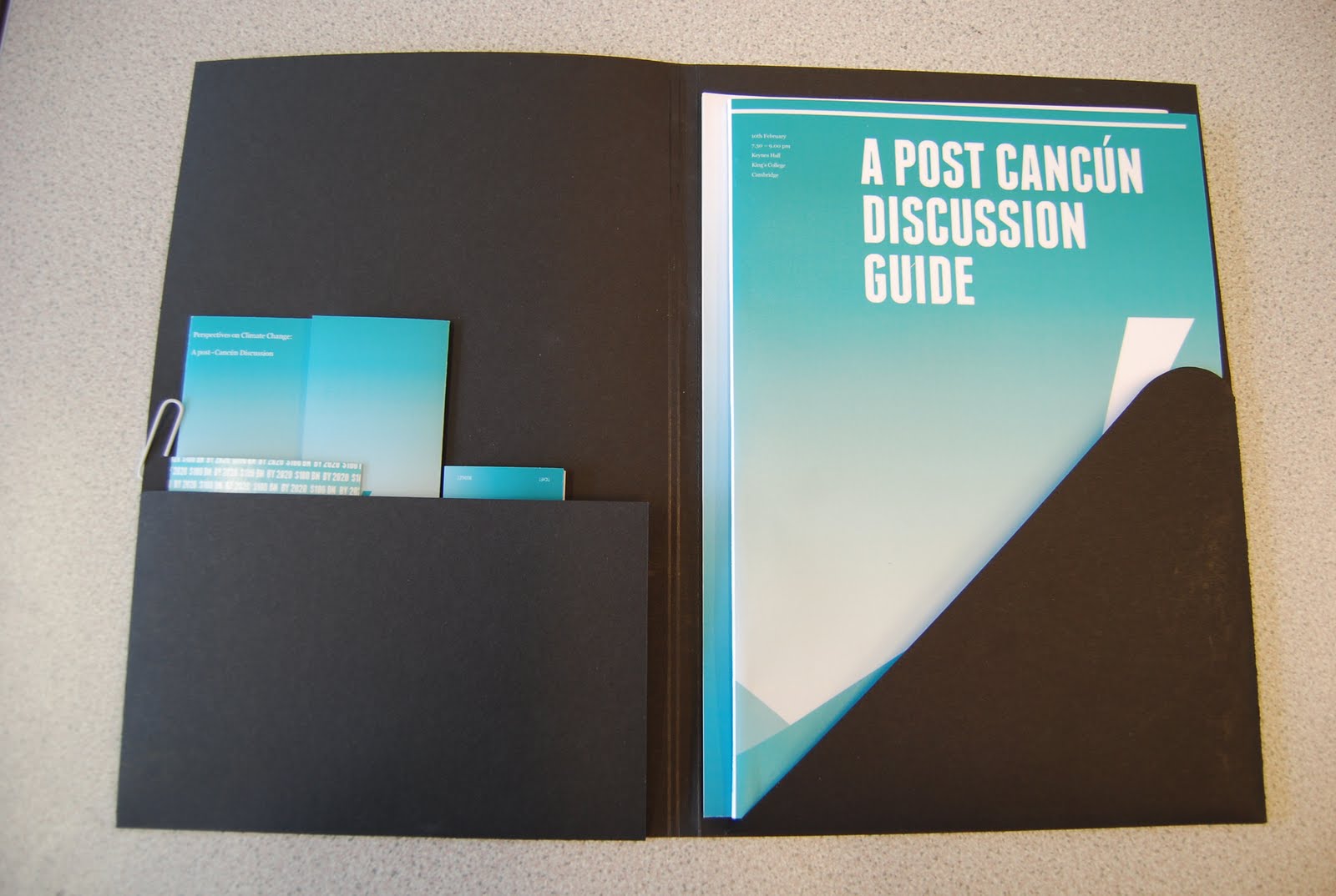
cancún Debate : Packaging
To add to the commercial nature of this project I want to packaging it in a smart commercial way for hand in. The brief does not equire packaging, so I do not want to spend too much time on it. For that reason among others, I may produce it using plain black card. perhaps a sticker would add to it, or if I do have time an emboss.
Using the ' as the recurring feature throughout the designs I have almost created an identity for the event beyond the colour scheming, type and image. I would like this to subtly play out through the format of the package.
This is a mock however, the scales are not perfect yet, I will spend some time next week making it properly. For now it is looking promosing.


Cancún Debate : Postcards
I decided the postcards should be informative, but more ambiguous that the rest of the printed material. They act as an awareness medium, and should therefore be aesthetcally considered, with a visual message re-enforcing them. Rather than the other way around.
Again it has been effective emplying the gradient t osome designs, wwhile other work well as a single colour or just whie. The top design is my favorite. It sums up the aims of the discussion event, as well as suggests tha nature of the Cancun debate itself in a single visualisation.
I did not feel it was necessary to include the date and time of the event, as it would have already happened. This is just a further awareness iten for people to send to friends and help spread knoeledge.


Tuesday 24 May 2011
Monday 23 May 2011


Sunday 22 May 2011
Cancún Debate : Production
If the University would require the print job to be sent for the cancun guides, I would urge them to use LULU, They jave the funds to get something of higher quality, but it really does not call for it. In fact the low cost of LULU would support the message and whole concept of the event. The parcicipants could even be encouraged to share a copy to reduce waste paper. Just an idea.
The cost was £1.80 per unit. So with attendence of 400 people the cost would only be around £800, not much to pay for si much awareness. Purchased merchendise such as the postcads and badges would go somwhay to making up the defecit.
An idea ouwl d have been to make this project completly neutraul, making the cost level out or even dedicating all the proceeds to an environmental agency or a local community to plat some trees. But that was not my focus, but conceptually would have been a good consideration.
Saturday 21 May 2011
Flatland : Invitation Colour Final


Friday 20 May 2011
James Jennifer Georgina

James Jennifer Georgina is a big book: 1,200 pages. Irma Boom’s revolutionary spine design allows the book to lie flat on any page. The entire cover and page edges are silkscreened in a brilliant soft neon-yellow glow; the colour lives big but does not dominate. Within this balance, Boom has reworked the limits of the page with a radical invention in storytelling and has reached a new level of equilibrium between design and narrative.
The book is a memoir divided into three sections: postcards, conversations and a photo album.
The 210 postcards are culled from 1,000 written to Georgina between 1989 and 1999 – the first ten years of her life – during a 282,162-mile odyssey undertaken by Jennifer and James, to keep James’s hands on the steering wheel rather than the bottle. Reprinted and transcribed, they to form the bulk of the book’s pages and bookend the stages of James’s alcoholism, starting with the spiral into his problem and ending with his final decision to stop drinking.
In a largely digital world, Jennifer chose to handwrite the postcards to her daughter every day they were apart. Some are even handmade from photos and collages. They contain stray thoughts – strawberries are in season a month early this year – grievances – the hotel is on a pond, which is full of ducks and mosquitoes. I wish one would eat the other – and aphorisms – the simpler the explanation, the closer the truth.
The postcards are joined by 21 conversations that, ten years later, the family made themselves sit down to have, addressing specific topics in the hope of achieving some sort of closure on issues that still dogged them in the aftermath of the disease. These unedited dialogues are unflinchingly open, but also honest in their willingness to spin off at whatever tangent the family’s collective spirit dictates. Laying open the forces that both bind a family together and push it apart, they have been described as a cross between Woody Allen cinema and Harold Pinter theatre – but will also ring true for anyone who has ever been in a family.
The book took nearly two years to produce and cost over 250,000 Euros. It is a treasure house of ephemera, the things that most of us discard and forget, yet which here provide the physical evidence of a family’s journey. It makes the case for three-dimensional books in an Internet age – an age of formless emails that are unlikely to be treasured and reread as these postcards were. It demonstrates the vitality of print and proves that the book object can never be replaced.
JAMES, JENNIFER, GEORGINA
Jennifer Butler (text)
Irma Boom (concept and design)
Erwin Olaf (portrait photos)
London/Amsterdam 2010
Yellow cloth sewn/in cassette 1,200 pages
Unique binding method with coloured edges
Full colour illustrations
Text in English
Edition limited to 999 copies
Price: €435.00
Jennifer Butler (text)
Irma Boom (concept and design)
Erwin Olaf (portrait photos)
London/Amsterdam 2010
Yellow cloth sewn/in cassette 1,200 pages
Unique binding method with coloured edges
Full colour illustrations
Text in English
Edition limited to 999 copies
Price: €435.00
Rob Walker : Look Book Cover
There are three directions for the the cover. The layout it is consistant. I reached this layout after much cover development but as usual with short turn around projects I saved over the development accidently, soooo, whoops.
Book Fair : Book Packaging
The wrap around and tied up bundle was inspired by the idea of education and students carrying their books to and from school in tied up bundles. The slightly traditional style block sans serif typeface Franchise works well with this idea and akes for an all round neat package, again adding a much needed high end edge to it.


Book Fair : Poster Packaging
I am very pleased with this outcome. The extra poster, printed duplex as a wrap around for the posters adds another dimension to the project as well as making the delivery of the product that much more high end, refective of the exclusive few prints of each design.


Fizz Bizz
The layout of this publication with its freedom and white space is remeniscient of our fine art yearbook layout, especially the cover. The technique of repeating type and image off the page seems to be a bit of a trnd at the moment. It is a clever way of expressing a concept however and at the moment I do not think it is an overused technique.


Subscribe to:
Posts (Atom)