Thursday 2 June 2011

FMP Evaluation

Over the course of my FMP I completed 8 projects plus my design context publication.  I had to drop a project, one that I really wanted to do, due to not having enough time but am glad none the less that I have something to work on once I have handed in.  I am pleased that all of the briefs I completed have developed my design skills and will help inform the initial steps of my professional career and provide a solid technical platform on which to base my developing practice.  Also I feel confident that my portfolio is strong now, showing a range of disciplines across a variety of deliverables.

My main regret is that I realised where my passion lies in design a little too late.  Had I researched more thoroughly or had my moment of epiphany occurred just a week earlier I would have been able to squeeze in the ‘discussion events’ project and leave a smaller project such as ‘Break out Lucille’ where it was before exploiting its potential range.  My epiphany was that responsibility and my own ethical standpoint was going to inform the projects I chose to work on, the audiences I wanted to engage with and the message driven content of my work. Up until that point my focus had been on the technical aspects of typography and layout, but once I was comfortable with the flexibility of my discipline in these skills, I was able to broaden my thoughts to the wider potential of subject matter and context.

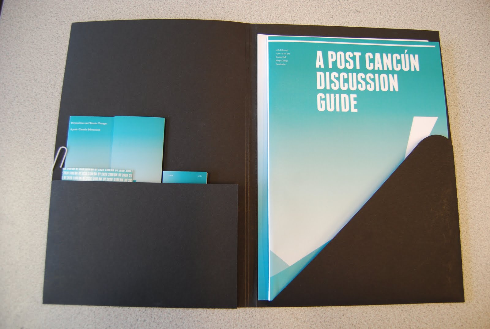
The ‘Cancún debate’ project was the most influential of my FMP.  Dealing with a live brief, that could potentially make a significant difference to people’s attitudes towards the environment changed my state of mind, from being a some-what impartial designer, to an emotional designer.  I learned that being involved with a brief emotionally as well as objectively greatly enhanced the dedication to the message, and I felt as thought I could empathise with the audience on a clearer and more effective level.  The research undertaken for my context publication (‘Discipline, Responsibility and Awesome Design) helped me re-evaluate where I was taking the project and made it much more accessible for its intended audience.

My typographic skills have improve to no end throughout the FMP thanks to the majority of projects I undertook, but I still feel as thought I can learn a lot more and am keen to buy books and find new sources of inspiration.  I had felt as though my rationale has limited me a little in terms of creativity, but am well aware that I am or was a student and was therefore still learning and should maintain my dedication and focus to the rationale before neglecting it for art direction.  Art direction and creating conceptually intelligent and creative solution across all media is certainly going to come into play more in my future; I do not see myself laying out type on a grid for ever…  However I have a strong passion for type, the form of type and the use of language though visual form, so I maintain that this will be the main feature of my practice.

Towards the end of the FMP I designed an identity for the photographer Rob Walker.  This was to test my speed at turning around a brief.  I was interesting to find out whether what I had learned throughout the FMP had paid off.  I was pleased to find that it had.  I worked very quickly and efficiently, creating a strong visual concept and identity and applied it to a concise, relevant range in just three days.  This fills me with confidence, and I will use self-directed short turn around identities as a concept building practice whenever I have no other work to be doing.

My main downfall was documenting my development work.  I like to work quickly so that ideas are fresh and full of enthusiasm, and find that by blogging especially breaks up those moments of inspiration and un-joins them.  However I concede that the typed form of evaluating ones own work is useful, as it focuses thought into physical form and can be very useful for developing ideas as well as clarifying.

Overall I have stayed on top of things throughout my FMP, slipping up only a few times, missing a print slot on one occasion and not being fully prepared for a crit. But what I have learned from this, is that things get in the way, and things go wrong, all I can do is be as efficient as possible to minimise these occurrences.  I am simply overjoyed that I have come to the end of what is has been a challenging three years, with as much passion for the subject as I could have hoped for.  Also I would like to thank everyone involved with the course, I doubt I would have had the same sense of fullfillment had I been elsewhere for my education.

Garry Barker : Brief (Pitch)

Rob Walker : Brief

Book Fair (Upper-Case Education) : Brief

Yearbook Pitch : Brief

Break out Lucille : Brief

Cancún Debate : Brief

Flatland : Brief

Fine Art Yearbook : Brief

Fine Art Yearbook : Final Boards

Book Fair : Final Boards

Break out Lucille : Final Boards

Cancún Debate : Final Boards

Flatland : Final Boards

Rob Walker : Final Boards

Rob Walker : Project Evaluation


Throughout my FMP I had not undertaken in a project that was simply identity driven.  I was interested to see if what I had learned throughout my FMP had changed my approach to identity design, as previously I had always felt my identities and logos were weak and basically boring.

My friend Rob Walker, a professional photographer based in St Albans required an identity to reach a higher class of audience and move on from small local projects.  I thought it would be a good idea to set myself a deadline of 3 days to turn around his identity, testing myself to some extent, whether I had the ability to think, design and finish a project in such a small time frame.

I jotted down a few concepts and landed on one after just an hour or so that I knew would work.  From there I began working on his business cards, as that is the medium that most clearly evidences an identity, then expanding across a range, referring to each other as I went to make sure there was continuity of layout and concept.

I had spoken to him several time before starting the project and knew he was looking for further promotional material, so naturally I decided a look book would be the ideal product.  As well as this I proposed a mail out poster as a cheaper solution and also a website that would be brought to life by his own ability with Adobe Flash.

I used Akkurat as the typeface, it has a neutral flexibility and ambiguity to it that suggests clarity but also a modern style.  I proposed 3 full ranges of identity to him, he liked the black and white approach the most, I did too and felt that was the simplest most objective solution.  So I ran it across the range, using his photography to enhance and create a full identity.

I think I have been successful in capturing the documentary approach that he applies to him projects, a social commentary though photography I you will.

I am very happy with the project, both conceptually, aesthetically and also with my own turn around speed. A great end to my FMP.

Wednesday 1 June 2011

Flatland : Project Evaluation


The ISTD Flatland brief has been an ongoing affair for some time.  I have actually done the brief twice now, once last module and again for the FMP.  Vickie and I worked as a collaboration on both occasions, but the first time round we ended up hating our outcome and thought it lacked concept.  So we started from scratch generating all new concepts and design directions, with new outcomes, formats and typographic choices.  This was a great idea as it gave us some perspective on how much we had improved since the last module and made us feel very good indeed.

We re-directed our focus towards the concept, and developed the idea of ‘not fitting-in’ which mirrors the journey of the protagonist in the novella, ‘Square’ who fights to break out of his 2D world (Flatland) and into the 3D world (Spaceland).  This was to dictate the free movement of elements around the formats we used.  Both Vickie and I enjoyed working outside of the grid, using elemental design to create dynamic form and layout taking inspiration from Postmodernist design and the work of Joel Evey.  Working without a grid was very useful to break from the idea that the grid is a fixed path that should not be strayed from. The poster evidenced this the most with elements shifting off the page only to re-appear elsewhere; while the chapbooks and the book covers were more orderly and function based.

I was not overly happy with the stock we used, it had a nice tone to it, but lacked texture and ended up being a bit flat, conceptually fitting… but aesthetically did not feel right.  We decided not to re-print due to lack of funds as well as the pressure of the ISTD deadline approaching.  We should have left ourselves more time for testing paper stocks, rather than designing on screen for so long.  I have learned this lesson and have worked in a better way, proofing as I design since then.

Vickie and I work well in a collaboration, although at time we are both a little soft on decision making. When something is worked we generally did not push the boundaries as far as we could have in order to discover something new and innovative.  However again I must say that this was due to the pressure of deadlines and working on multiple projects.  If I were to do the brief yet again I would certainly expect to see all manner of interesting designs.

We were working on this project at the same time as working on the Fine Art yearbook and our individual Book Fair briefs, I also had an identity brief on the go, so was juggling all sorts day to day making it hard to dedicate any lengthy periods of time to it.  Another lesson was learned here; be ambitious, but not over ambitious! I have learned my limits for now.

All in all I am happy with the project and especially with one of the product shots that is my splash page.  I like to utilise my abilities with photoshop where possible, and with the concept of freedom, it seemed fitting to make something visually interesting.

Cancún Debate : Effective DPI

For someone who is specialisting in type and print I should really have noticed the Effective DPI of my first Cancún board 'Range' shot.  It is at 78 dpi...brilliant, even more brilliant as I have sent it o ptint over night just a few hours ago and I have £0 in my bank to reprint.  Hmmmm, a puzzling one, ill have a look tomorow, and it it really is that bad ill fork out.

Cancún Debate : Project Evaluation


(The promotion of a discussion event, aimed at raising awareness and educating people to the wider implications of environmental issues that were discussed in Cancún Mexico in November 2010).

The Cancún discussion event brief was undoubtedly the most useful, enlightening and fulfilling project of my FMP.  From what started out as a request from a member of the debating society at Cambridge University to design a poster for a discussion event, snowballed into a project that has changed the way I think about my role as a graphic designer as well as of course helping me improve several design skills.
It has been plaguing my mind for some time now, wondering exactly where I fit in within the design culture, and I cannot say even now that I have that clearer idea.  But what this project has provided me with is a starting point to examine and explore the implication of being a responsible designer, not just to the client and the audience, but also to myself and the public at large.  If we have the power to deliver a message effectively to society, why not direct it at something I feel passionately about and would want to see improved.  I am talking about the environment mainly and the idea that society, as a whole would be doing more.  Not just turning lights and taps off, but also engaging intellectually and actively in some way that will benefit others.

Initially I tackled the brief in 3 days, producing a typographic poster that I was very happy with. Straight to the portfolio I thought.  However soon I begun thinking that although it was technically and aesthetically sound, it lacked depth and reason.  So I picked it up again and begun re-designing.  (At this stage I was happy to hear that the discussion event at Cambridge Uni had the biggest turn out yet).  Things moved quickly and I found that my development work was simply being thrown aside so that I could run off and test something else. The blog suffered here but that doesn’t really bother me, I would rather have learned what I did than pick up 2%.  (Don’t hold me to that when my grade comes back).
I think I could have developed a better concept to make the intellectuals think, binding the project together on a higher level. (This could be a personal desire to make myself seem clever though). But through my context research, I found time and time again that the most effective way to reach an audience and make them think was not to make them feel stupid or clever, but to simply spell the message out in an interesting and engaging way.  So through the use of interesting formats and folding methods, along with some subtle playing on words and a bold colour scheme I aimed to create an identity for the discussion event as a practice in engaging the audience and ‘evoking interest.’
Writing this now I can see the potential to exploit this idea of engaging an audience, but at the time when you are simply trying to put a project together in a busy studio you can loose yourself in the technicalities of type and layout.  Which leads me on neatly…

The Cancún discussion guide was the main feature of the project, containing all sourced research into the events at Cancún, informing me as I designed.  I used a four-column grid to stop myself from getting carried away with fiddly details that would do nothing but add texture ultimately.  I tried to remember at all times that I was not designing for designers, but for a real audience who could make a difference should I be successful in my job.  Therefore the layout was very accessible, with lots of white space and a logical hierarchy.  I employed the use of rules to sub-section relevant information, and aimed to create balance on each page, conceptually drawing to the idea of a neutral and balanced discussion.
I could talk in lengthy paragraphs about the typeface choice, but I will keep it simple:
Headers: Franchise / Bold sans serif, reminiscent of newspapers, suggesting important global informative news. Almost mono-spaced to ease of scanning.

Body: Georgia / Gentle Serif, intellectual but not sharp like Garamond or Baskerville, suggest intellect and an importance and also a trustworthy sense in the information that is being presented.
The site specific installation piece seen on my boards is much more along the lines of what I should have been doing all along.

Project > Concept > Development > Key deliverables > ENGAGING CONCEPTUAL IDEA(s).  This would have made sure I addressed all aspects of every brief.  I know this now. Hurrah.

So you can see it has been a very helpful project indeed.  I have not mentioned everything because there is so much that can be taken away from everything you do in this bizarre discipline.

Garry Barker : Project Evaluation

The Garry Barker pitch struck me as a good chance to work on a substantial project that would be something a little different to what I had been working on so far this year.  It would have brought a very hand-made and Traditional element to my portfolio and would also have been a good experience in working with a client. However it was not to be, as we did not with the pitch; we being Ben and I.
I chose to work with Ben because of our similar interest in typography and publication design.  I saw his work in the studio and noticed that his approach to typography was different to mine.  It is more image based, and he is more free to let the design direction be a by product of problem solving, rather than my approach which is to narrow my focus instantly to typefaces, layout, format and concept.  Finding a balance between the two in my mind would surely result in a killer combination.

Our main downfall for this pitch was simply not putting aside enough time to really nail it.  Our outcome was good, it certainly addressed the brief, but I knew in my gut that it was not quite there.  The elemental / flexible packaging solution that Garry was looking for was addressed, but the identity side of the pitch was lacking.  We picked up on the fact that Garry likes Traditional design, the letterpress and the use or ornamental decorations.  I too, and Ben also have a slight guilty pleasure for this and thought we would explore the design direction in this way.

My input for this brief was largely in the development of a grid and the layout of the type and also the development of formats, while we worked together to brainstorm packaging solutions to contain the various elements within the pack.  We decided on the second of three days that it would be more beneficial to produce a Photoshopped mock up on boards than to spend all our time making a fully printed proof of our the entire package for the pitch.  Looking back I would say that it is almost always better in cases where there are various elements that a fully printed version would be better so that the client can get a true feel for what they would be getting. But to be honest, at the beginning of the module we were simply not yet up to full speed and would have required a fourth day in order to achieve a fully printed proof.
Saying this, I was impressed with what we came up with, slightly lacking in concept and identity, but technically sound as well as functional.  Looking back, I am glad we did not win the pitch, because it would have taken up a lot of time and I would potentially have not undertaken in the briefs that I did which I have thoroughly enjoyed for the most part.  Also it now seems as though the Garry Barker brief is going to continue on after hand in, which is not something I would have desired.

So in reflection, the pitch came at a great time.  It forced me to work quickly and generate physical and digital mock ups rapidly, great practice for studio life.  It provided me wit the right work ethic to get stuck into my next project.

Fine Art Yearbook : Project Evaluation


Undertaking in the Fine Art yearbook project as collaboration with Tim, Vickie and Liam filled me with confidence.  We are all dedicated to spending time in the college and therefore were almost always be available to discuss progression, issues and ideas face to face.  As well as this we had the fortune of having a very helpful and organised group of Fine Artists to get feedback and necessary files from.  This made our job a lot easier, so many thanks to them.

As our design practice’s all follow a similar thread, working closely with typography and layout, we knew our outcome would be largely typographic, making design direction development easier from the outset.  It played into our hands well having the Fine Art yearbook, because with a multi-faceted discipline such as Fine Art, the work must speak for itself, allowing us to utilise our typography skills to subtly enhance the work, rather than become a design feature of the book itself.

It was also the first time I have worked closely with a printer, client and a tight budget all in one.  With considerations to do with stock, finish, page numbers and colour entering the equation.  I found this very liberating, being able to choose exactly what we wanted within a budget.  It gave me faith in the fact that I was going into a career that though is a problem solving process; with the intention of pleasing a client and an audience, we as designers are also at liberty to have fun and extract a great deal of satisfaction.  I also found it particularly satisfying negotiating the costs of each element of the design.  I was largely in charge of the document structure and logistics, deciding how many pages were needed, and where page breaks would be needed to control pace and make up the page count.

For the designing each of us were allocated a section of the book to design once the direction and master document was set up.  Liam did this, as his attention to detail and pure dedication to spending time on one thing, making sure things are exactly correct allowed us to think creatively and freely without the nagging thought that perhaps there was an error in there somewhere.  However Myself, Vickie and Tim are all very confident in our abilities to do this too, but Liam was the man for the job none the less.  We worked on our own section, bringing them back together to form a complete book.  From there we sat as a group or in pairs critiquing each spread and constantly considering how a spread might work better.

Our attention to detail with the type was especially evident; aesthetically, conceptually and technically. While designing the Flier with Tim, we had a lot of fun tweaking the Colons and Hyphens and thinking more about how the subtle changes and variation of these would affect the overall design. 
While the brief was indeed substantial in terms of learning curve and interaction with industry, it did feel a little thin on personal design.  Working as a group of four had a lot to do with this, but at this stage of our design professions it was very interesting to work in a larger group on a single project, and although there is not much of a range to speak of, the impact of working on a brief such as this during my FMP has no doubt filled me with confidence that I could do it all again alone without a moment hesitation.

If one thing alone can be taken away from this project, it would be that I now certainly have the confidence and the professional state of mind needed to work in industry and communicate appropriately.

Yearbook Pitch : Pitch Boards

Design Context : Delivery


Tuesday 31 May 2011

Garry Barker : Boards

Sorry about the low resolution. It was such a while ago that the original files have simply been cleared away. Something else to evaluate there I think. Dont delete it until you really don't need it! You can just about read it if yo use your super-vision.

Fine Art Yearbook : Final Fliers

Thursday 26 May 2011

Design Context : Proofing 02

Design Context : Cover Proofing

Cancún Debate : Tickets


cancún Debate : Packaging

To add to the commercial nature of this project I want to packaging it in a smart commercial way for hand in.  The brief does not equire packaging, so I do not want to spend too much time on it.  For that reason among others, I may produce it using plain black card. perhaps a sticker would add to it, or if I do have time an emboss.

Using the ' as the recurring feature throughout the designs I have almost created an identity for the event beyond the colour scheming, type and image.  I would like this to subtly play out through the format of the package. 

This is a mock however, the scales are not perfect yet, I will spend some time next week making it properly.  For now it is looking promosing.


Design Context : Proofing 01

Cancún Debate : Postcards

I decided the postcards should be informative, but more ambiguous that the rest of the printed material.  They act as an awareness medium, and should therefore be aesthetcally considered, with a visual message re-enforcing them.  Rather than the other way around.

Again it has been effective emplying the gradient t osome designs, wwhile other work well as a single colour or just whie. The top design is my favorite.  It sums up the aims of the discussion event, as well as suggests tha nature of the Cancun debate itself in a single visualisation.

I did not feel it was necessary to include the date and time of the event, as it would have already happened.  This is just a further awareness iten for people to send to friends and help spread knoeledge.


FMP Boards Proofing

Sunday 22 May 2011

Design Context : Book Layout 03

Rob Walker : Promotional Poster

Cancún Debate : Production

If the University would require the print job to be sent for the cancun guides, I would urge them to use LULU, They jave the funds to get something of higher quality, but it really does not call for it.  In fact the low cost of LULU would support the message and whole concept of the event.  The parcicipants could even be encouraged to share a copy to reduce waste paper.  Just an idea.

The cost was £1.80 per unit. So with attendence of 400 people the cost would only be around £800, not much to pay for si much awareness.  Purchased merchendise such as the postcads and badges would go somwhay to making up the defecit.

An idea ouwl d have been to make this project completly neutraul, making the cost level out or even dedicating all the proceeds to an environmental agency or a local community to plat some trees.  But that was not my focus, but conceptually would have been a good consideration.

Saturday 21 May 2011

Rob Walker : Lookbook Layout

Flatland : Invitation Colour Final


I am not going to hand these in because the print finish was a bit iffy and there was not enough justifucation to spend another few hours at drop in just to print this, so here it is.  They would be run accross the range of colours, however if production to made, we would select jsut a few colour sof the range, or print out a bit shet of them to be cropped later.

Friday 20 May 2011

James Jennifer Georgina


James Jennifer Georgina is a big book: 1,200 pages. Irma Boom’s revolutionary spine design allows the book to lie flat on any page. The entire cover and page edges are silkscreened in a brilliant soft neon-yellow glow; the colour lives big but does not dominate. Within this balance, Boom has reworked the limits of the page with a radical invention in storytelling and has reached a new level of equilibrium between design and narrative.


The book is a memoir divided into three sections: postcards, conversations and a photo album.
The 210 postcards are culled from 1,000 written to Georgina between 1989 and 1999 – the first ten years of her life – during a 282,162-mile odyssey undertaken by Jennifer and James, to keep James’s hands on the steering wheel rather than the bottle. Reprinted and transcribed, they to form the bulk of the book’s pages and bookend the stages of James’s alcoholism, starting with the spiral into his problem and ending with his final decision to stop drinking.
In a largely digital world, Jennifer chose to handwrite the postcards to her daughter every day they were apart. Some are even handmade from photos and collages. They contain stray thoughts – strawberries are in season a month early this year – grievances – the hotel is on a pond, which is full of ducks and mosquitoes. I wish one would eat the other – and aphorisms – the simpler the explanation, the closer the truth.
The postcards are joined by 21 conversations that, ten years later, the family made themselves sit down to have, addressing specific topics in the hope of achieving some sort of closure on issues that still dogged them in the aftermath of the disease. These unedited dialogues are unflinchingly open, but also honest in their willingness to spin off at whatever tangent the family’s collective spirit dictates. Laying open the forces that both bind a family together and push it apart, they have been described as a cross between Woody Allen cinema and Harold Pinter theatre – but will also ring true for anyone who has ever been in a family.
The book took nearly two years to produce and cost over 250,000 Euros. It is a treasure house of ephemera, the things that most of us discard and forget, yet which here provide the physical evidence of a family’s journey. It makes the case for three-dimensional books in an Internet age – an age of formless emails that are unlikely to be treasured and reread as these postcards were. It demonstrates the vitality of print and proves that the book object can never be replaced.


JAMES, JENNIFER, GEORGINA
Jennifer Butler (text)
Irma Boom (concept and design)
Erwin Olaf (portrait photos)
London/Amsterdam 2010
Yellow cloth sewn/in cassette 1,200 pages
Unique binding method with coloured edges
Full colour illustrations
Text in English
Edition limited to 999 copies
Price: €435.00

Rob Walker : Look Book Cover

There are three directions for the the cover. The layout it is consistant. I reached this layout after much cover development but as usual with short turn around projects I saved over the development accidently, soooo, whoops.

Book Fair : Book Packaging

The wrap around and tied up bundle was inspired by the idea of education and students carrying their books to and from school in tied up bundles.  The slightly traditional style block sans serif typeface Franchise works well with this idea and akes for an all round neat package, again adding a much needed high end edge to it.


Book Fair : Poster Packaging

I am very pleased with this outcome.  The extra poster, printed duplex as a wrap around for the posters adds another dimension to the project as well as making the delivery of the product that much more high end, refective of the exclusive few prints of each design.