Monday, 28 February 2011
Thursday, 24 February 2011
BAGD Yearbook Pitch : Result & Meeting
Lose or Win?
So our rather ambitious pitch for the BAGD yearbook was unsuccessful. However we are now doing the fine art yearbook which opens up the chance to be more experemental.
The BAGD yearbook, though being a fantastic opportunity to create something for the industry that will be recognised nationally, I feel is more restricted in terms of creativity. As it is graphic design that is being represented it should really appear to be fairly neutral, and playing safe is not something I like doing at all. Therefore I am quite glad to have the fine art book instead.
Meeting
Our first meeting with the fine art reps was good. They had some examples of what they would like to see as well as an idea of potential finishes. This gave me some good feelings about the collaboration between the two of our groups.
Design Context : Context Workshop
Workshop
The context workshop was a clarifying session, helping us put into perspective the research that I should be undertaking in, from the most basic to the insightful and groundbreaking.
The general idea was to write down out interests, the issues raised by those interests and ask questions to be answered through out research relating to them. A very useful workshop indeed is my thoughts. It is not such an epic task as I had imagined, but simply a natural progression of an increasingly aware practice with the context of the design world.


Cancún Debate : Negotiated Range
Mail-out
The mail out will include;
- Publication
- Invitation
- Statement / Question indicator
Publication
The publication is designed around a flexible format that can be both informative and promotional. The fold enables it to be read as a small publication, informing attendants to the isses covered, as well as background Cancun information to provide wider interest to a less informed audience.
The content drives the information, while the reverse is a poster that can be used as further promotion. It is based on a simple grid, like the poster, that makes the text very accessible, leaving space for headers and photographs (if needed) to create a neat and diverse product.


Invitation
The invitation is aimed at a leaned towards an intellectual audience through the central alignment of elements and motif of the ' in Cancun. (Which cannot be typed in blogger...)


Question/ Statement Indicator
As well as invitations there are statement and question indicators. These will be perferated for the user to pop out. It will aid the progression and smoothness of the discussion as well as encouraging the audience to participate in wider topics and personal thoughts.
They are the same format as the publication and invitation, creating a neat package of elements within the mail-out.


Cancún Debae : Cancun Poster
These are the working colours for the final design range. I am not sure that either of them work on their own at the moment, and I want to avoid using two colours. So further colour development is needed. However this is the final layout for the design.


Poster
The poster design was the starting point for this brief. The layout is based on creating a hierarchy that puts on an emphasis on the event as well as the speakers that will be attending.
It is a fiarly straight forward layout, using a grid organise key information, with the secondary information alogning to other elements elements. The descision to include the enlarged 'Cancun' was mainly an impact descision, but also helps to create white space in the top right of the poster creating a natural step-dwon through the information.


Cancún Debate : Brief in Brief
Brief
The brief is a short turn around poster design for a discussion event, concerning the issues raised by the Cancun debate. The discussion requires further promotional material that can be produced on a low budget with the aim of informing a wider audience and appealing to an economically / environmentally aware audience.
Concept
The poster and range will be type driven. It will be clear and succinct, with a focused message.
The range of promotional material will be designed for mail-out packages.
Range
The range of promotional material for this debate can be varied from pure promotional material, to a tied together identity through invitations and seat numbers for example.
The proposed range I will be designing for is;
- Poster
- Informative publication
- Invitations
Wednesday, 23 February 2011
BAGD Yearbook Pitch : Layout Development
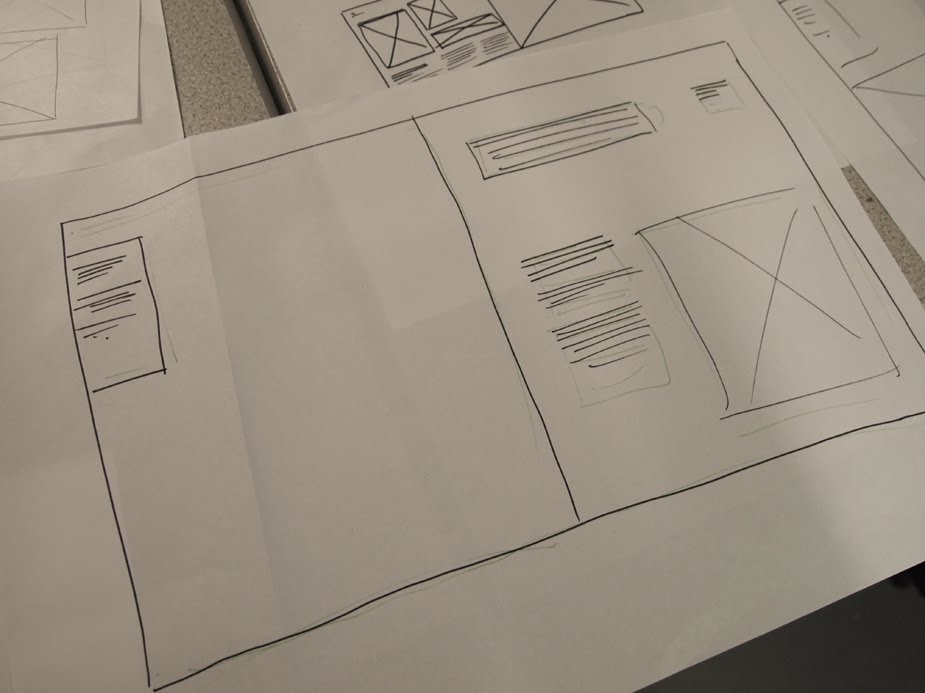
Firstly, as I am sure you are wondering why there is a school photo on the cover, that was was a genuine cover idea we had for the yearbook. It would be a lot of fun to shoot and would create a strong sense of the group being bonded and ready for the design community.
The contents page uses both the gutters as well as the colmuns to create a dynamic form. It is certainly interesting but maybe a little bold. The layouts focus of the images rather than the text which is pushed to the sides in 8pt. I bugun playing with the idea of having justified captions for each photograph, to create a more catalogue effect than an exhibition guide, which is how last years appeared.
Towards the back end of this document I thought about how the proffessional and tutor statements would feature in the book. We descided that we wanted the book to be more proffessional by making it more of a designers reference guide that studios would keep on the shelves and use as a kind of designers catalogue.
The stock may well change here and be a thinner weight to have the phone book page feel. The pages of book susch as the yellow pages fall open gracefully and let a glimpse of what is coming on the next page. However in our case it would not be more and more numbers, but some exciting images of work...
I thought about using an 11 column grid in an attempt to create a more asymmetrical style of layout. The dea being that with 11 columns, the discplacement of information could be allocated and make for a more dynamic layout. However it turned out that it was no more interesting than a 12 column grid, but did enable me to play with elements of the design more freely, such as the information / statement section.
Initially these spreads are very eye catching and bold, with a clear emphasis on the work, not the type. By setting rule accross the top it gave the layouts a catologue aesthetic. The text would always be featured in the same position throughout the book and would therefore be predictable but functional.
The full bleed images in contrast with the multiple smalle images would give the peoples work a chance to have priority and scope.
This is an example of how diverse the layout could be with this grid system and layout approach. The type is well out of the way at the top of each page, spaced neatly accross the 2 pages. The images has the freedom to work in both 3 and 4 columns in a series, as well as being enlarged to move around elements of type, which leaving plently of white space.
Cancún Debate : Approaching the Poster
As I received this brief as a quick turn around poster design (2 days) I wanted to push myself to make something interesting almost instantly. Now the thing is 9writing again in the future) Jo said he really likes this layout, as do I, but as this is a substantial brief I must push on and try new things.
I am aware that designing for communication within the public sector requires an emphasis on the message and not the technical ability of the designer. For me this poster is sexy, if I am aloud to use that word to analyse my own work. It worked at the event too, I good news from the person I did the job for that more people than ever turned up for their discussion event, so I succeeded there. But being sexy does not reach the public, they don’t care, so I owe it to myself as a designed aiming to push my ability to empathies with the audience to re-direct the design to make it more accessible and draw in a wider interest.
Tuesday, 22 February 2011


Saturday, 19 February 2011
BAGD Yearbook Pitch : Group
For the BAGD yearbook pitch I will be working with Vickie, Tim and Liam.
I have worked in collaboration with Vickie before for the ISTD Flatlans brief. We worked well together with both concept development and negotiating roles. Tim and I share an interest in typography and layout, I am sure we will combine ideas to generate some good results. I have not worked with Liam before but I know he works long hours and will push the descision making on quickly.
We aim to win the pitch for this yearbook, as we feel the potential for a far more engaging publication would be a step forward.
Monday, 14 February 2011
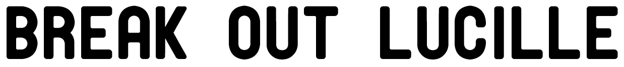
Break out Lucille : Final Logo

The final logo is set on an irregular, inconsistent baseline. Well, I placed the wood blocks by hand instead of using leading basically. This made for a more independent effect.
The 'break' is slightly more textured than the more solid 'lucille.' While the rotated 'out' provides for interesting composition and form.
I am confident in this logo, it is fairly exciting visually and is tied together with a sound concept. The more immediate visual symbolism of breaking out will make for interesting play with firther promotional material and potential format descisioins.


Break out Luculle : Woodblock Logo
After a meeting with the fine art representatives I hurried down to the Vernon Street branch for a logo prtnting session. I had 4 hours or so before the drop-in session finished wchi would give the prins just enough time to dry, provided I got them printed fairly quickly.
I did not take my existing design proposal with me, just a memory of what the form was. I am glad I did becuase it made the exploration of playing with layout more successful and enjoyable. Process driven ideas and inspiration is much more fullfilling as a designer than pushing computer images around.
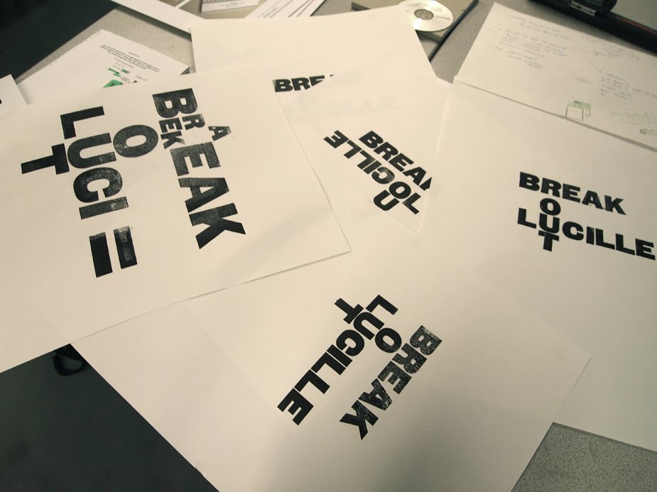
I spend about an hour making the prints for the logo. The problem I encountered was that there were too few point size variations to create the exatct logo I had proposed. Therefore I knew I would need to scan and digitally alter the composition post print.
This did however give me the chance to have more freedom in the print I produced, as they would ultimatly not be the finished article.

The nearest solution to the acctual logo was this print above. As you can see it has a lapse in readability and coherence as the 'break' and 'out' appear to read vertically as 'rout.'

Although the printed finish with its mistakes is always quite a nice effect, in this case it would add too much of a suggestion towards grunge; not the desired effect.

Something pretty cool happened while printing... I managed to break the 'T' letter form in the press by applying too much pressure (ironic considereing the name of the band). I wanted to push it hard to create a small bleed of ink and a slight emboss to create a more taxctile effect once printed flat on promotion.


I thought the print below was interesting. The type reads back to front and then upside-down. However I do not think this necessarilty drastically deminishes the readability of the logotype, and is infact quite a successful exploration of hierarchy.

Below, I used a larger point size of wood block. The annoying thing being that several letter forms were missing. So instead I treated the type as image and aimed to create a more geometrically composed print. It is interesting, but not as functional as the logotype itself.

Sunday, 13 February 2011
Break out Lucille - Pitch Images
Along with the black and white copies of the logos working at different scales I took along some quick mocked up visuals of the logo along to the meeting, contextualised on CD packaging.
Though I though this might not be neccessary it proved useful in the meeting as the band was more enthusiastic to my designs as a result of the effort I had put in. A useful tip taken on board there.
A client will only be as enthusiastic as the designer.


Saturday, 12 February 2011
Neomi Ross : Letter Press and Woodblock


Letterpress from Naomie Ross on Vimeo.
Just a few lovely images and a great vid to get into letterpress again. Loving it. Must make sure to keep this up once I graduate. Not a bay way to spend your free time is it.
Break out Lucille : Logo Development
Development and selection


Working from existing typefaces that had more character than the traditional set of typefaces was the basis for creating an independent band aesthetic. Though I much prefer not to use such subjective typefaces, in this case, starting here and then refinind the tone may be an appropriate approach.
Some of the elements of these typefaces were subtle but effective; such as the underlined 'O' of Malamondo, the rigid line of extended caps from Grand Canyon and the modernistic rounded edges of the Grotesque.


I had a day or two in which to generate an outcome while working around the Yearbook pitch among other things. The initial sketches quickly led me to creating a visual form through thetypeface Franchise (sans). It took formal inspiration from the headline style typefaces used for letterpress.
This compositional deisgn takes advantage of the natural impact of a headline typeface. It's subjectivity suggests an opinionated tone with mild punk reference to New Wave anarchy, while the refined layout maintains order and solidarity.
This logo, based on a heavily stylistic scripted brush is more suggestive or ornamental in it's design. The hand written style aids the negation all notions of commercially sustained production value.
Based heavily on the typeface at the start of the post, this logotype applies the concept of 'breaking out' in a more ambiguous way. The stenciled type is suggestive of prison and confinement and is a contrast approach to the form based and the hand drawn solutions.
Subscribe to:
Posts (Atom)