Here are a bunch of spreads that I am considering for the final design stage. I can see that some are not working as spreads, the movement is just not correct.
These pages that are heavy in text are slightly easier as the nature of them is to be informative over aesthetic and concept. So the main detailing lies in balance, accuracy and articulation. Things to be aware of are type weight relationships 2:1 with headers and 1.5:1 with upper and lowercase body copy and sub headers.
The rulers help guide the reader to the pieces of information that are linked. While there are also vertical rulers that are 0.4mm in weight that run just inside the gutter. These separate different areas of the same topic. This is the first time I have user vertical rulers, I am confident that in the publication they will sit well and will aid the clarity and not confuse it.
 |
| Add caption |
Fixing the past and the future..hmmm, no I am not a fn of these spreads at all, they are not typographic and work only on one level of meaning. I need to re-visit this spread.
A little a lot is a really embracing page. I only had one layout solution for this, but it was the obvious direction and it is effective, grabs attention and emphasises the point that there is a lot of money needed. Not in gold though. A gold Foil would be great here, but I just don’t think it would be an effective use of my time to foil something just now.
I prefer the double spread for the Under One Roof spread. The dynamics of the layout across one page just does not have the same effect and is not in keeping with the other similar pages.
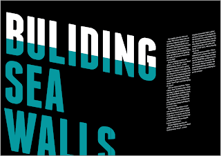
Building Sea Walls also needs to be re-thought. It is too ambiguous at the moment. The clarity of the message needs to be more straight forward.


No comments:
Post a Comment