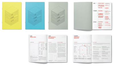
I have been looking at a lot of modernist design recently, and this is very reminiscent of the designs that came out of the late 30s. The overall design solution is for accessibility of information. The illustration style is clear and vectored, suggesting clarity and precision and ties neatly in with the entirely accessible simplicity of the type driven content.
The layout deals immediately with hierarchy, through simple use of scale, pt size, colour and composition. It has bothered me for a while now that design seems to be repeating itself, however through my research into my dissertation I can see why that has happened, and in fact it is not something to get depressed about, but instead something to understand. The modernist ideology was to create maximum communication of the message and information while being as sinmple and direct as possible.
The combination of playful art direction and clever use of typography for this NB-Pulse magazine is really inspiration here. I often get told that I do not edit or change the type within my designs, I agree with this, but the reasons for me not doing it up until now had been justified. I simply did not think I had a deep enough understanding of typefaces and individual characters to do this effectively.
However now I can see that the simple, dissecting, altering with mixed media and re appropriating of the words on the page are a simple but highly effective solution to interesting typography, and most importantly it is concept driven with thought, and I like to think..
There are examples of reverse out, cut text, adding letter to change the meaning, full bleed, scale variations and visual representation of physical objects and themes.
The Futu magazine also uses typography in a very pleasing way. It is certainly conceptual and has an air of Newspaper style to it. Perhaps this was some inspiration. The contrast between the blank spot coloured pages and the black and white typography makes reading this magazine a fun one to read or flick through. The flick-through-ability is something I want to achieve. This will include stock choice as well.
A great concept for the Fedrigoni brief that was released 2 years ago. It uses die cutting, a process I may look at where necessary. I want to make sure that when a process is necessary, I use, or test it. But I want to avoid forcing a process in order to simply aesthetically enhance a piece of work. (unless promotion is the key concept).


The choice of correct and appropriate format is what I was looking at here. The type does not dominate, but makes itself known through use of white space and readability. The images are a fantastic enhancement of the type and create a cold and emotional response. It does not insist to be looked at, which suggests to me that the target audience of this would respond in possitive way. This is a clever piece of work that combines, colour, layout, type and image to convey a specific tone and reaction. I guess that is what makes a successful piece of work.


No comments:
Post a Comment