Showing posts with label OUGD303 DC. Show all posts

Friday, 20 May 2011

James Jennifer Georgina


James Jennifer Georgina is a big book: 1,200 pages. Irma Boom’s revolutionary spine design allows the book to lie flat on any page. The entire cover and page edges are silkscreened in a brilliant soft neon-yellow glow; the colour lives big but does not dominate. Within this balance, Boom has reworked the limits of the page with a radical invention in storytelling and has reached a new level of equilibrium between design and narrative.


The book is a memoir divided into three sections: postcards, conversations and a photo album.
The 210 postcards are culled from 1,000 written to Georgina between 1989 and 1999 – the first ten years of her life – during a 282,162-mile odyssey undertaken by Jennifer and James, to keep James’s hands on the steering wheel rather than the bottle. Reprinted and transcribed, they to form the bulk of the book’s pages and bookend the stages of James’s alcoholism, starting with the spiral into his problem and ending with his final decision to stop drinking.
In a largely digital world, Jennifer chose to handwrite the postcards to her daughter every day they were apart. Some are even handmade from photos and collages. They contain stray thoughts – strawberries are in season a month early this year – grievances – the hotel is on a pond, which is full of ducks and mosquitoes. I wish one would eat the other – and aphorisms – the simpler the explanation, the closer the truth.
The postcards are joined by 21 conversations that, ten years later, the family made themselves sit down to have, addressing specific topics in the hope of achieving some sort of closure on issues that still dogged them in the aftermath of the disease. These unedited dialogues are unflinchingly open, but also honest in their willingness to spin off at whatever tangent the family’s collective spirit dictates. Laying open the forces that both bind a family together and push it apart, they have been described as a cross between Woody Allen cinema and Harold Pinter theatre – but will also ring true for anyone who has ever been in a family.
The book took nearly two years to produce and cost over 250,000 Euros. It is a treasure house of ephemera, the things that most of us discard and forget, yet which here provide the physical evidence of a family’s journey. It makes the case for three-dimensional books in an Internet age – an age of formless emails that are unlikely to be treasured and reread as these postcards were. It demonstrates the vitality of print and proves that the book object can never be replaced.


JAMES, JENNIFER, GEORGINA
Jennifer Butler (text)
Irma Boom (concept and design)
Erwin Olaf (portrait photos)
London/Amsterdam 2010
Yellow cloth sewn/in cassette 1,200 pages
Unique binding method with coloured edges
Full colour illustrations
Text in English
Edition limited to 999 copies
Price: €435.00

Fizz Bizz

The layout of this publication with its freedom and white space is remeniscient of our fine art yearbook layout, especially the cover.  The technique of repeating type and image off the page seems to be a bit of a trnd at the moment.  It is a clever way of expressing a concept however and at the moment I do not think it is an overused technique.


Wednesday, 18 May 2011

Anthony Burrill

Graphics guru Anthony Burrill has just released a new series of prints, featuring his trademark typographic slogans. Burrill’s bons mots this time around are calming directives—Clear Your Head and It All Makes Sense. There is also a double-sided poster that he has created in collaboration with Alain de Botton, as part of the GraphicDesign& project (see issue 189 of Grafik magazine for a full report on GraphicDesign&). Screenprinted on 350gsm grey board, one side of the poster reads “pessimism is not always deep,” while the other side sports the motto “optimism is not always dumb”. As usual we like Burrill’s thinking and the posters look pretty damn gorgeous too.


I really enjoy directive, informative and inspiration design, especially when it is 1. About design & 2. Typographic.  I am not all together sure why, it is not like I need any more moral guidance at athis stage, nor is it a yearning to appear to be thinking deepy. After all these posers are a by product of practice, not thought.
(quoted from Grafik 2011)

Saturday, 14 May 2011

Fine Art Yearbook : Quicksand Typeface

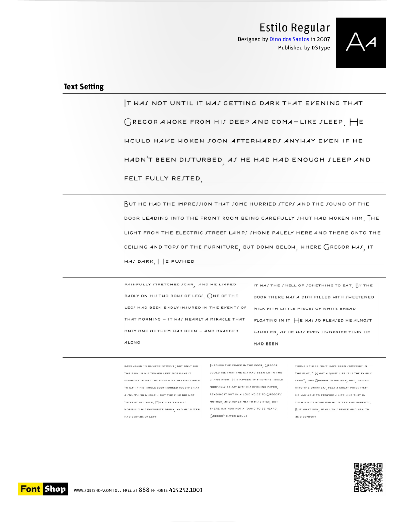
The typeface Estilo that Liam found needs to purchased before we can show them a quality use of it. However we have sourced another typeface which is similar called Quicksand. It has some interesting features on the Q the tail of the R and has a nice consistency across letters such as K X & Y. The uppercase is what we will most likely be using as it is reminiscent of the Turner prize book the Fine Art lot showed us. I usually use fairly regular typefaces, but the use of either Estilo or Quicksand is working appropriately.


Sunday, 8 May 2011

Cancún Debate : Publication Development

I am not sure about the front and back inside cover pages. The photography is gentle and sets the tone of calm debate. However the use of Franchise seems to cheapen the introduction. Originally I had used Garamond, but it was too formal. I have now changed the serif typeface to Georgia which has rounder serifs and is less formal, but still intellectual.
Other than that I am happy with the spreads and their order. I am now considering sending it to print.


Friday, 15 April 2011

Fine Art Yearbook : Typeface Estilo

Liam found this typeface while on his train ride home. It is as close to what the fine art reps wanted for their header copy as we could have hoped for. The inspiration is taken from the Turner Prize publication that they supplied us with.
Some of the Lowercase glyphs are not so nice, they just don’t sit right, however the uppercase works really well. It costs $17 so we will need to run it by the Fine Art reps in our next meeting.


Wednesday, 30 March 2011

The Lover

Besigned by Harold Pinter this 'The Lover' range for a theatre production is slightly strange for some reason.  The sharp type and red suggest promoscous behaviour as well as love and passion.  The very clean modernist layout is married well with the rather deep yet cold photographs.

I think it is well designed, providing the show is about a love that is not all that it seems.  As it is a theatre production that is almost certainly the case.  The big red bards are confusing, maybe they conceptually represent the couple, wile the thin line between suggests a gap, a small sliver where all is not as it seems. Who knows... I would have to talk to Pinter to find out this much I suppose.

Yeah, I like it.


Atipo and my Context book

So I saw this book and thought it was stunning.  I have a book that has a similar style to it called Foyle's Phalivery.  It is a collection of uncommon words in the english language, but that is another subject.  Working with black, red and white it makes for a powerful but graceful aesthetic.

I have drawn most inspiration from Vignellis Canon, cosidering the grid structure of it and the format.  This is an homage you understand, not a replica...  I had been thinking about using a more traditional typeface, rather than being typically 'Modern' going for either Helvetica, Akkurat or something like Grotesque.  I had thought about Baskerville or even Garamond, but know I think it would be nice to find myself the perfect serif.  Not an easy thing to do in just a few weeks but hay ho.  I want something gentle but crisp, medium contrast but not to flashy.


This book combines beautiful layout, a managable format and graceful binding.  I especially like the red thread.  I had something similar in mind, against the will of Fred who really doesn't want us to be thinking about the final article at thispoint, but of course thats impossible, we are designs...  I have draw up plans for it which I will scan and blog soon, tomorow I rekon.

Atipo


I couldn't quite place my finger on this group.  They are obviously prestigious and highly regarded, with collaborations with designers such as Muller Brockmann in the past.

Beyond this I picked out this series of poster designs for classic cinema films.  Some of them are truly beautiful and are produced though collaboration with art directors, designers and specialist printers.  The Maltese Falcon poster is technically brilliant in terms of print and typography.


Another example of typography merging with hand print is the Raging Bull poster.  The words themselves are full of character and provoke strong impact alone.  I just love the heirarchy and colour, there are so many levels of detail on a large scale image of this.  I would be happy to get a copy.


The poster on the left was designed by Muller Brockmann unsurprisingly. I am not sure how I feel about it, I am sure I have seen this exact design on another piece of his work, and that is essentially the problem with those pesky modernists.  Just as you start to love it and understand it you have the parallel realisation that its all the bloody same.  I do however like the opposing perspective of image and type, moving in different directions.  This created tension and hold the eye for some reason.


Function, Restrain and Subversion in Typography


The beauty of contemporary graphic design is that dozens of movements emerge and re-emerge from view. Yet, too often we are left with only the vague impression that something is going on. To appreciate what that might be requires us to slow down, ignore superficial trends, and take a more in-depth look. This is the approach taken by Function, Restraint, and Subversion in Typography, a survey of minimalist and brutalist typography in contemporary graphic design. This international collection documents the work of more than twenty-four graphic designers who engage in an aggressively simple typography. Lavishly illustrated with commentary by author J. Namdev Hardisty, the book explores the innovative posters, books, signage, and other forms of print design by such well-known designers as Daniel Eatock, Experimental Jetset, Spin, the Walker Art Center’s design studio, as well as those just beginning to make a mark on the design world, including MGMT., Project Projects, SEA, Xavier Encinas, Manuel Raeder, YES, and more.
About the Author
Namdev Hardisty is the founder, with Kimberlee Whaley, of The MVA, through which he has worked on print, web, and signage projects for a variety of clients, including Intermedia Arts, Minneapolis College of Art & Design, The Weisman Art Museum, and Analog Clothing. Namdev’s work is featured in Over & Over: A Catalog of Hand-drawn Patterns and Hand Job: A Catalogue of Type, both published by Princeton Architectural Press. He is also the author and designer of New Skateboard Graphics (2009). He received his BFA in Graphic Design from Minneapolis College of Art and Design in 2003.

Author: J. Namdev Hardisty
Year: 2011
Language: English
Format: 20,3 x 25,4 cm
Features: 256 pages, 390 color illustrations, 20 b/w illustrations
ISBN 9781568989662


Brogen Averill

Brogen Averill is a lot more commercial that the work I usually look at.  However recently I have been thinking about my role in this design world.  The old quote, 'be the change you want to see.' or something like that is a confusing one.  While what I want to see is better design accross the board, for independent businesses as well as large commercial companies I also want to see green fields and more nature.  

I have come to the conclusion that this is the two main desciding and contrasting factors of me.  On one side I like things like this Department Store identity and range, while I also need to address issues such as preservation, conservation and awareness to subjects that provoke and emotional response.  I think I can be both.


This first layout seems to pay homage to the great Karl Gerster and his typo-photo style that dominated catalogues for decades, a lagacy that has barely changed in the more fashionable companies such as this.


I have to quams with type looking sexy for the sake of sexy, as long as the job is done correctly.  This certainly is.  The slightly feminie typeface which is Century Expanded by the looks of it reflects the high-end fashion concept that the department store emmits.


The crisp and clean cut identity makes me very jelaous.  It is so bloody simple, its just a black box with some black type in it.  It looks like Grotesque, but could be any number of typefaces form these shots.  It really impresses me how these ideas are so simple yet effective.  The concept is addressed through a clean cut delivery and a simple excecuton. The Department Store exists as a fairly cold but very modern frame which by the looks of it can be placed anywhere and still look culturally relevant and awesome!


Studio MW #2

There were only a few things of sudio MW that stood out, and after researching into Postmodernism for my dissertation I saw a lot of design that I liked for its play and process.  The work of April Grieman for example.  These T-shirt designs are fairly straight forward, but the process of making them has had influence from the Postmoder era. Not only this but it reflects the culture of Paris more so that other French studios.  Usually it is all big serif type (very sexy) but in this case they have used colour and form to attach itself conceptually to the diverse and colourufl landscape that is paris.