Working from existing typefaces that had more character than the traditional set of typefaces was the basis for creating an independent band aesthetic. Though I much prefer not to use such subjective typefaces, in this case, starting here and then refinind the tone may be an appropriate approach.
Some of the elements of these typefaces were subtle but effective; such as the underlined 'O' of Malamondo, the rigid line of extended caps from Grand Canyon and the modernistic rounded edges of the Grotesque.


I had a day or two in which to generate an outcome while working around the Yearbook pitch among other things. The initial sketches quickly led me to creating a visual form through thetypeface Franchise (sans). It took formal inspiration from the headline style typefaces used for letterpress.

This compositional deisgn takes advantage of the natural impact of a headline typeface. It's subjectivity suggests an opinionated tone with mild punk reference to New Wave anarchy, while the refined layout maintains order and solidarity.

This logo, based on a heavily stylistic scripted brush is more suggestive or ornamental in it's design. The hand written style aids the negation all notions of commercially sustained production value.

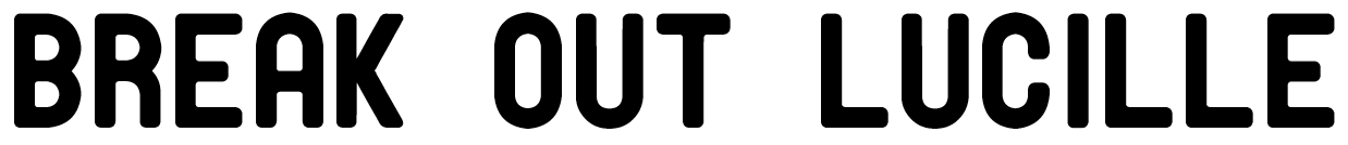
Based heavily on the typeface at the start of the post, this logotype applies the concept of 'breaking out' in a more ambiguous way. The stenciled type is suggestive of prison and confinement and is a contrast approach to the form based and the hand drawn solutions.
No comments:
Post a Comment