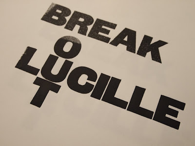
After a meeting with the fine art representatives I hurried down to the Vernon Street branch for a logo prtnting session. I had 4 hours or so before the drop-in session finished wchi would give the prins just enough time to dry, provided I got them printed fairly quickly.
I did not take my existing design proposal with me, just a memory of what the form was. I am glad I did becuase it made the exploration of playing with layout more successful and enjoyable. Process driven ideas and inspiration is much more fullfilling as a designer than pushing computer images around.

I spend about an hour making the prints for the logo. The problem I encountered was that there were too few point size variations to create the exatct logo I had proposed. Therefore I knew I would need to scan and digitally alter the composition post print.
This did however give me the chance to have more freedom in the print I produced, as they would ultimatly not be the finished article.
The nearest solution to the acctual logo was this print above. As you can see it has a lapse in readability and coherence as the 'break' and 'out' appear to read vertically as 'rout.'
Although the printed finish with its mistakes is always quite a nice effect, in this case it would add too much of a suggestion towards grunge; not the desired effect.
Something pretty cool happened while printing... I managed to break the 'T' letter form in the press by applying too much pressure (ironic considereing the name of the band). I wanted to push it hard to create a small bleed of ink and a slight emboss to create a more taxctile effect once printed flat on promotion.
I thought the print below was interesting. The type reads back to front and then upside-down. However I do not think this necessarilty drastically deminishes the readability of the logotype, and is infact quite a successful exploration of hierarchy.
Below, I used a larger point size of wood block. The annoying thing being that several letter forms were missing. So instead I treated the type as image and aimed to create a more geometrically composed print. It is interesting, but not as functional as the logotype itself.


No comments:
Post a Comment