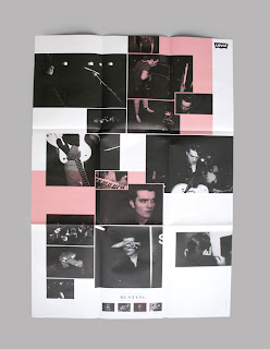
Studio Neo Neo are based in Geneva, their work is fatastically European and eccentric. Eccentric in terms of creative thinking and conceptual approach rather than pusing the boundaries of what is physically possible.
There seems to be a bit of a fad of having images placed around all over the page at the moment. I have no problem with this, I think it is a really effective visual solution, and in terms of layout with image it has opened the mind of clients more conceptual approaches.
Usually I like to leave type alone and use it rather than ubuse it. I mean leave it un-altered and leave the type designers who know what they are doing to make me a letter form that works. However as I begin to understnad the sturcture of type more and more I feel as though I would begin to effectivly adapt type to work around a concept. Something to be thinking about going into the last phase of design.


No comments:
Post a Comment