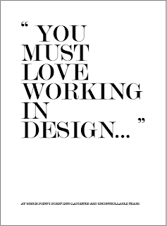
Some spreads worked well with eachother to create a theme and again re-inforce an idea.
As this is a personal project I felt I should include a bit of me in the tone. A bit like Craig Oldham I suppose my natural tone is a bit abrasive, instead of holding back I thought I would just role with what I typed. Perhaps a little crude but, well thats just too bad.


No comments:
Post a Comment