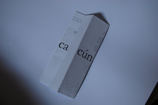
Due to using experimental foling methods I have to lay the type out very accuratly, this required some testing that became rather frustrating but a little fun too.
Here the document printed out backward, I dont know why I thought I would need to flip the type, I must have been tired. Quite an interesting experiment with heirarchy though.
It was especially difficult to make the smaller details feel comfortable when you do not know exactly what it is going to look like from on screen.
The scale of the invitation here is far too big, 4x too lage I think. Infact I may have hit scale to fit accidently. The annoying this about testing work is that when you prin something in the mac suits, it is not the same outcome as down in the dungeon. They do diffferent technical things with the doc when going to print,
It is getting there now, still need to sort out the scale. But it it is useful printing this scale for now so that I do not have to crop everytime I want to do a quick test.
I have thrown some smaller information around the edges, centrally justified. It is 6 pt so is really just texture, nit is still fliv informatio about the topics being discussed.
The flier format I am using enables me to put down a lot of infprmation on several facets of the format. It is really interesing.
I do not think this type face is working it is too dull and informative, nor really selling the event to the younger audience.
I acctually managed to get this to line up in just 2 tests, pretty impressive I think. Though the layout of other information needs to be tweaked.


No comments:
Post a Comment